This is how to write a homepage for your website, step by step.

Pull up a seat, and let me show you how to write a homepage for your website — even if you’re not a copywriter.
In my years of writing copy for creatives, I’ve learned one thing for sure:
Your homepage is prime real estate.
It’s often the very first thing someone sees when they land on your site.
And you know what they say: “First impressions last for such a long, longgggg time.
Website visitors barely stay 10 seconds before deciding if they’re staying or clicking away. Only 1, 2, 3… 10 SECONDS to roll out the welcome mat, pour the metaphorical coffee, and convince them to settle in.
I’ve written enough homepages to know it’s possible to make your dream clients actually stay long enough to binge your website like their favorite high school series.
And in this post, I’m going to show you exactly how I do it.
Why your homepage copy is important
Before we get into how to write a homepage for your website, here are four reasons you need it.
Your homepage gives the first impression
Think about the last time you met someone, and they had spinach in their teeth the entire conversation… *chuckles awkwardly*
That’s what a weak homepage is doing to your business right now.
Nobody’s telling you. They’re just… noticing, and quietly judging, and leaving.
Your homepage is very often the only shot you get at a first impression. So, MAKE IT COUNT.
It removes the overwhelm
Not everyone who lands on your site knows where they’re going.
A new visitor doesn’t know where to look, what to click, or what actually matters. Left on their own, most people won’t dig around trying to figure it out. They’ll just leave.
A good homepage does the deciding for them. It says, “Here, look at this first, then this” — so instead of wandering around confused, they’re guided exactly where you want them to go.
This way, you can help your website guests get over decision paralysis while making them stay.
It improves the user experience
This one’s less obvious, but it matters!
A clear homepage just feels better to be on.
It’s the difference between a website that feels like a maze and one that feels like someone actually thought about the person reading it.
And that feeling? It shapes everything else. Whether they trust you. Whether they stick around. Whether they come back.
And it’s not just them. In the eyes of search engines, you earn a greater reputation too because the user experience is seamless.
It shows how smooth the process of working with you will be
To an extent, your homepage copy layout tells a target client how streamlined your processes are.
That’s because your homepage is a preview.
Whether you mean it to or not, it’s quietly telling your readers something about how you actually run things. Clean, clear, easy to follow? That reads as organized. Confusing, cluttered, hard to figure out what’s even happening? That reads as… well, exactly what it looks like.
Should they decide to work with you, they can say what it’d be like. At least, this is what I think when I land on website homepages.
Now that you know why homepage copy matters, let’s talk about how to write a homepage that attracts and converts your audience.
Want more inquiries and sales from your website? Grab the Fix Your Copy Guide for five tips to instantly make your website copy ~at least~ 5x better.
How to write a homepage for your website
Homepage copywriting can sound like one hell of a job, especially if you’re not a copywriter.
But lucky for you, it’s my favorite thing to write!
All that frustration about where to start, what goes where, and how to write a bomb-ass homepage ends here.
Using my client’s homepage copy formula as an example, here’s how to write yours.
1. The hero section

This is it. The very first thing anyone sees when they land on your site.
Which means it’s carrying a lot of weight for one little section. It needs to do two things, fast: be clear, and be exciting.
Clear, because your reader needs to immediately know they’re in the right place. Not after scrolling. Not after squinting at a clever tagline trying to decode what it means. Immediately. If they have to work to understand what your site’s about, they’re not going to stick around long enough to figure it out.
Exciting, because “clear” alone won’t keep them scrolling. Clear tells them where they are. Exciting gives them a reason to keep going.
So how do you actually pull that off?
Start with your headline. This needs to nail your unique value proposition, short and simple. Then you can back it up with a subheadline (like “ADHD coaching for adults”) and little subtexts underneath (like “intensive life…”) to add just enough context, as seen in Melissa’s hero above.
Your hero section’s whole job is to answer “what is this, and why should I keep scrolling” — in about the time it takes to blink.
Nail that and your homepage actually gets a chance to do its job.
2. Value walkthrough
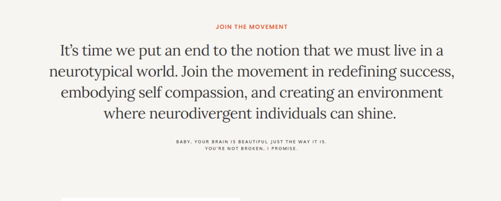
Your hero section got them to stop and look. Good. But it can’t carry the whole homepage alone.
That’s where this section comes in.
It’s where you slow down a little and actually say the thing. You can reiterate your brand mission, or dig into how you help your reader get what they want and stop dealing with whatever’s frustrating them right now.
It’s less “quick hook” and more “okay, let me actually explain what I mean.”
And here’s the fun part. This section has no ground rules. Make it as short and punchy as you want, or go longer and really sit in it. Both work.
What matters isn’t the length. It’s whether your reader reads it and can relate to the message.
Keep reminding them why you, why this, why now—by making the value to their life impossible to miss.
Get that across, and they’re not just still on your page. They’re leaning in.
3. Mini-about section

Because what’s a first date without an introduction?
You wouldn’t sit across from someone on a first date and say nothing about yourself, right? Just… stare at them and let them assume things? Weird. The same rule applies here.
Visitors are browsing your website for the first time. It’s a date!
So, show them the actual human behind the brand. Your face, your personality, and a little bit of who you are so they can start thinking, “Oh, I like this person,” in about two sentences.
Introduce yourself the way you actually would in real life. A little backstory, a little personality, whatever makes you YOU—and make it brief.
Share just enough to make them feel like they’ve met you and would like to know more. You can save the long version for your About page.
Give them a person to connect with, and the rest of your homepage gets a whole lot easier to believe.
4. Social proof

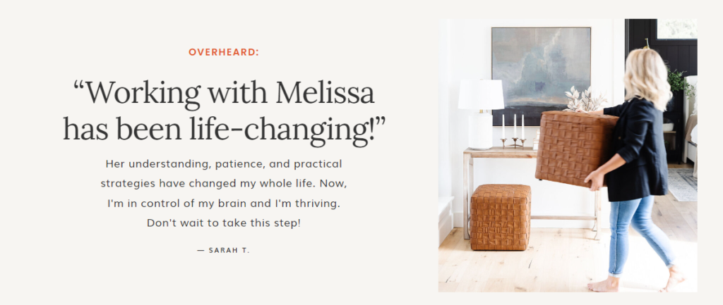
Here’s the thing about people landing on your homepage:
They don’t just believe you because you said so.
I mean—would you?
If some random business owner told you “I am the best at this and that,” with zero backup, would you just… take their word for it?
Nooo. You’d want proof.
Everyone does. Your reader is no different.
That’s what social proof is for. It’s the part of your homepage that says, “Don’t just take my word for it. Here’s the receipt.”
You can share client testimonials, press features, logos of brands you’ve worked with, results, before-and-afters, certifications—anything that backs up what you’re claiming about yourself with something a little more concrete than vibes.
This is the part of your homepage that further builds trust while your reader’s still deciding whether to stick around. Don’t skip it.
5. Offer featuring
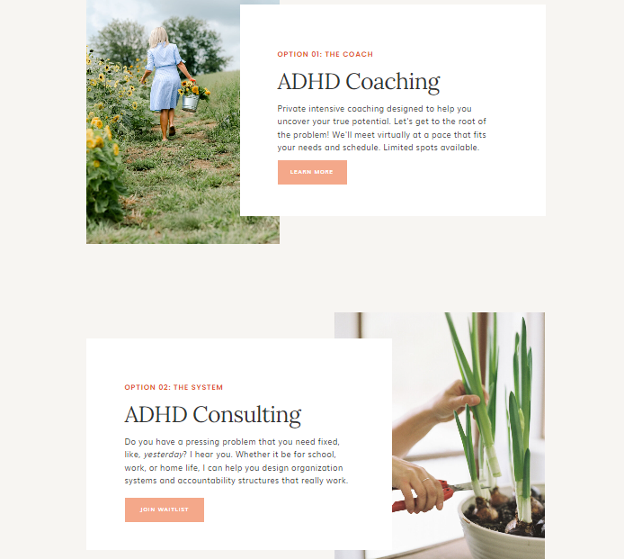
By this point, your reader likes you, gets your value, and is thinking “okay… so HOW can I work with you?”
That’s what this section answers.
Your offers deserve their own little spotlight on the homepage.
Don’t bury them three clicks deep and make people hunt for them. Most people won’t.
So, give a quick summary of what you offer, with a link over to your Services page for anyone who wants the full details. Simple as that.
People are far more likely to take the next step when you make it obvious what that next step even is.
6. Featured section
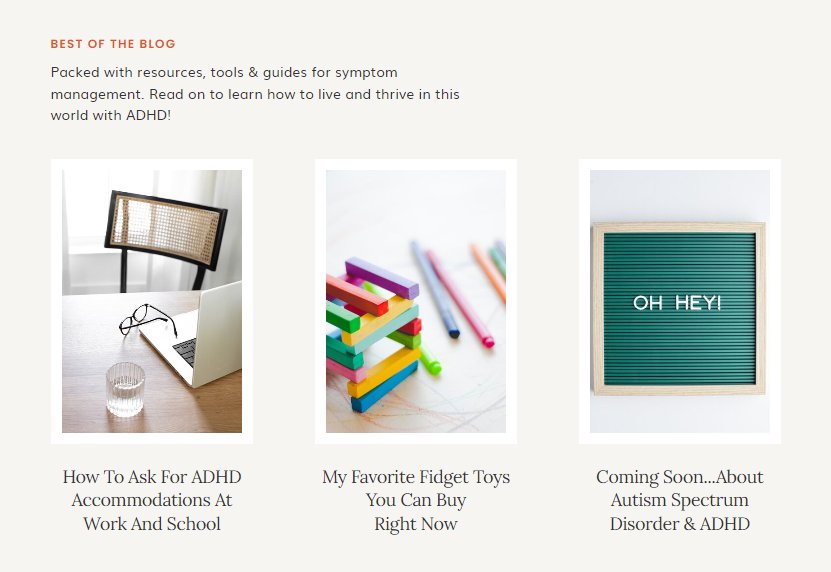
Not everyone landing on your homepage is ready to buy, book, or hit your Contact page right away.
Most people want to poke around first. Get a feel for you. Kick the tires a little before committing to anything.
And that’s totally fine. You just need somewhere to send them.
Your homepage is basically a hub of links to everything else on your site, and the featured section is where you get to hand-pick what you actually want people exploring—whether that’s a pillar blog post you’re proud of, your podcast, or a resource that shows exactly how much you know what you’re talking about.
It keeps people on your site, gives them more reasons to trust you, and—bonus—it means they’re leaving with a better impression of you even if they don’t reach out today.
Not every visitor converts on the first visit. But every visitor can leave a little more convinced than when they landed.
7. Lead gen opt-in
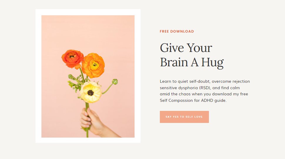
That someone comes, scrolls, and doesn’t buy now doesn’t mean the conversation has to end.
A lead generation opt-in is basically a sign-up form that collects subscriber details in exchange for a freebie or lead magnet.
It’s something that turns a random visitor into someone on your list instead of someone who leaves and you never hear from again.
If list building is your thing, this is exactly where you pin your freebie. And if it’s not, I suggest you start with an email newsletter.
And here’s why it matters more than people think:
Your homepage and your blog are usually the highest-traffic pages on your entire site. Which means if you’re not capturing any of that traffic, you’re letting a lot of “almost” leads just walk right back out the door.
So give them a reason to stay connected, even if they’re not ready to say yes to anything else yet.
Worst case, they get a great freebie (which is still a win since you’ll be helping their business). Best case, they’re now on your list, warming up until they are ready.
8. Final call-to-action
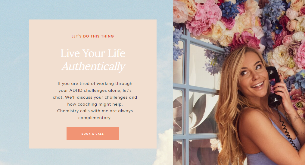
Okay, picture this: someone scrolls all the way down your homepage. They read the hero, they got the value walkthrough, and they saw your offers.
They’re engaged. They’re warm. They’re right there.
And then… nothing. The page just ends. No next step, no direction.
Your final CTA is where you close the loop.
After everything they just read, tell them exactly what to do next—book a call, shop the offer, join the list, or reach out. Don’t assume they should know what to do. Tell them.
Note: Every page you write—every website page, every blog post, every email—needs a CTA.
(Here are 72 CTA ideas for increased engagements and conversions.)
Want more inquiries and sales from your website? Grab the Fix Your Copy Guide for five tips to instantly make your website copy ~at least~ 5x better.
Want to write better website copy?
If you made it this far, you clearly care about getting your homepage copy right, and honestly?
That already puts you ahead of most people.
So, here’s where to go next, depending on where you’re at:
Want free tips in your inbox? Subscribe to my newsletter for weekly copy tips to grow your biz.
Ready to hand this off completely? I write websites for creative business owners just like you. If you’d rather have someone handle this for you, that’s exactly what working with me looks like.
Already have a homepage, just not sure if it’s working? Get a copy audit. I’ll take an honest look at what’s there and make it wayyyy better. I promise.
More of a DIY person? Grab my website copy template to write your website with total confidence.